Now that you know what the GDPR will require of you legally, and, in principle, by design, we enlisted one of our own Smartian brainiacs to share what product designers are dealing with on the ground, and in practical terms. You’re welcome.
There are many takes on how to bring your company into GDPR compliance by May, but while your amazing product and legal professionals are busy interpreting the letter of the law, the next step is to work within those definitions to manifest the requirements into simple, clear UX for end users.
In SmartRecruiters’ case, we have several users to think about, and we needed to remove recruiting teams’ worries about “Am I being compliant?” while also being upfront with candidates about what we’re doing with their personal data.
So what is that sweet spot on how far to technically and legally push the design in end-users’ favor, without your site’s front-end looking like a multiple-choice questionnaire?
Keep asking questions
Once you have a list of GDPR requirements laid out, such as where in your product you require active consent, where you need to provide the opportunity to withdraw, etc, start the design process by asking yourself some questions:
- What exactly are you doing with visitor information/data?
- What can I do to make for a smooth user experience?
- How do I balance that smooth experience with my own technical and business needs?
Allow us to work in hyperbole to give you some examples. For instance, if you allow users to create profiles on your site:
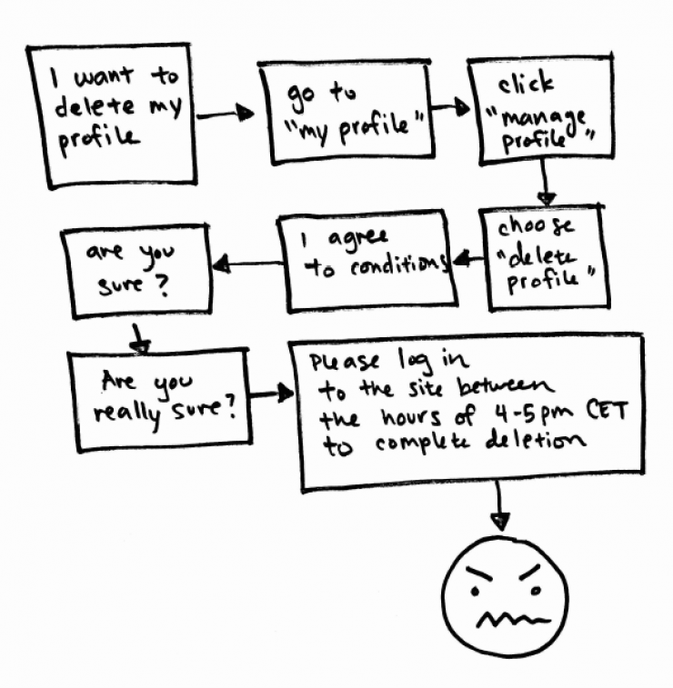
This is Bad UX
We know you want to prevent users from deleting their profiles, but you shouldn’t put a long flow in a way that a user might feel disappointed, rushed, or any combination of less-than-positive emotions. Not only would friction alienate these users, this would also not fit the GDPR requirement for “easy access”.
There is also Too-Literal UX
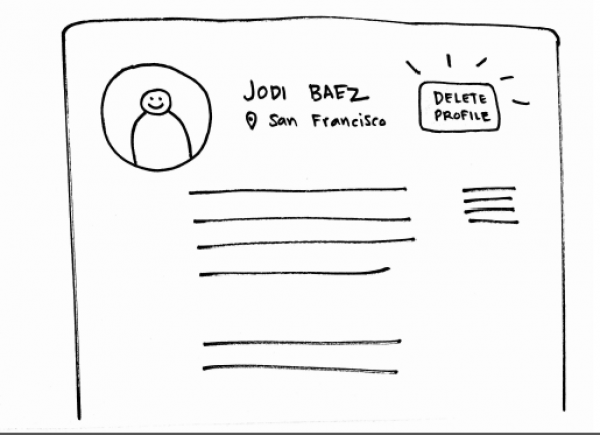
A big red button hits the requirements of “easy” and “clear,” but that kind of prominence obviously increases the likeliness of a click, which would come at a cost to you in higher numbers of deletes/withdraws.
Aim for Sweet-Spot UX
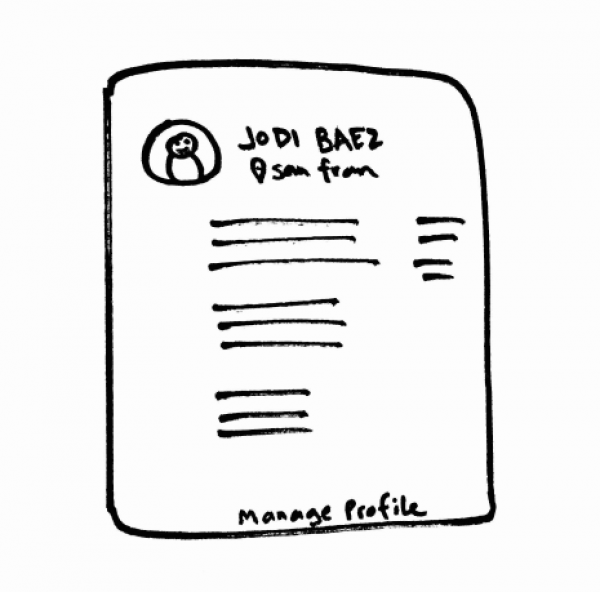
Human mental models dictate that scrolling down is often where the action is. Footers are normally where you find unsubscribes in emails, sitemaps on websites, and they also keep exit actions out of a users’ line of thought, while not making them inaccessible either. In this case, it would be appropriate to place any “manage” or “delete” actions in a footer. But if you have the time, you can always user test to make sure this holds true for your context.
Be Clear and Honest
Once you have the answers to the questions above, ultimately the key is to be clear about your intentions.
Think about why GDPR is there in the first place: to give the sense of control back to users. Build this into your user flows. If they no longer want their data associated with you, understand why instead of going on the defensive. Where would they intuitively go to withdraw their consent? Do they know exactly what that means? How can we make it clear what happens when they press the button, enacting their “right to be forgotten”?
Forming and answering these questions can be fun, and approaching any regulation design in this way transforms compliance into less of a begrudgingly implemented requirement, and more of a way to do your duty in making the internet a better place.