The New York Times creates an interactive information model where the demographics are up to the reader, but the findings are all come down to the data. We went and tested it out.
In their latest study, the Equality of Opportunity Project used the data of 20 million Americans in their late thirties to trace their earning potential based on gender, class, and race. The results paint a dire picture of the impact of racism across class lines, and naturally inspired an in-depth article from the New York Times. But it’s this week’s follow-up that has people talking: an interactive information model where readers can compare two demographics of US children to see how likely they are to jump income brackets in adulthood.
This information model matters (and is actually really exciting) because it shows the potential of technology to make people aware of social injustices and mental constructs that feed unconscious bias,, reflection that can translate to real dialogue and real solutions.
The whole point of the NYT model is to frame the conversation of earning potential and class in terms of race and gender, yes, that proverbial worm-can that is intersectional identity, or the idea that social identities overlap in ways that further oppress already marginalized groups.
Though the idea of ‘class not race’ often comes across as a less charged conversation (especially in the workplace), it’s also clear that if we ignore race when it comes to the wage gap, we aren’t seeing the whole picture. Same goes for gender.
The interactive model allows the user to compare two demographics of disparate gender, race, or class of origin, and then feeds your preferred dataset into the model to reveal the earning potential and class mobility of each one.
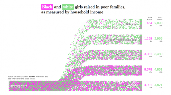
Of black and white girls from poor families, only two percent of black women become rich adults, while white women transition from poor to rich at a rate of 11 percent. This data set above is a great place to start a productive conversation about intersectionality.
Just imagine, as part of your business, holding a diversity seminar where employees use interactive models to learn about the impact of social identities.
As a trial, one can select Native American boys and girls from poor families, and white boys and girls from poor families, and watch the tiles, each one representing a child, either rise to higher income brackets like leafs in an auspicious breeze, or roll horizontal like a tumbleweed.
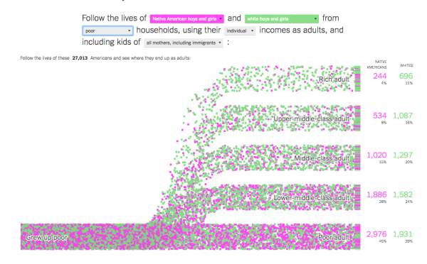
After watching for a few seconds it becomes clear that the majority of both demographics are most likely to stay poor: Native American boys and girls at a rate of 45 percent versus white boys and girls at 29. The disparity becomes more intense the further up the social latter you go. The model caps out at 50,000 people, and at the end we were left with the likelihood of a white child born into a poor family making it to the top income tier, over three times that of a native child raised in a similar situation.
Now the data you find can mean many different things, and it may not help you win a fight with your racist Uncle Jack next Thanksgiving, but it can help all of us create a more informed public discourse around complicated topics like wage disparity as it pertains to gender and race – and we can all agree that we all need that!
Link to interactive model here!